✽ Eliot Porter ✽
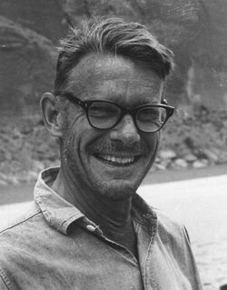
Personal Background Eliot Porter was born in Winnetka, Illinois in 1901. As a young child he would take pictures of the nature around his house, but then he had later decided that he would take a different path. He worked as a scientist and a teacher for a while. After that, later in his life he had decided that he wanted to pursue the life of photography and printing techniques. His work, after a lot of criticism later ended in him getting a Guggenheim Fellowship and a show at the Museum of Modern Art in New York for his color photography. He died on November 2, 1990.
|
|
Style
Porter had discovered a passion for fine art color photography later in his life. When he was a teenager he mastered the art of black and white cameras, and darkroom techniques, and by the 1950’s he focused more in color photography. Porter began to use a cumbersome large-format camera. He liked to use artificial lighting to make the pictures that he took more dramatic looking. The color adds power to the pictures by adding depth. Porter accentuated the color tones in his prints by deepening the blues and greens.
Philosophy
The purpose of his art was to take a closer look into nature, and make people see the beauty of nature that they might not have seen before. He had begun his passion for taking pictures of nature after he had discovered his love for landscapes.
Eliot Porter had also studied science, and it had also giving him an interest of documenting different kinds of birds through film photography. When he used to take pictures of birds, he would sit and wait hours for the perfect bird to come by so he could take a picture of it. He was very active in the cause of environmental preservation, therefor he would document the beauty of nature.
Eliot Porter had also studied science, and it had also giving him an interest of documenting different kinds of birds through film photography. When he used to take pictures of birds, he would sit and wait hours for the perfect bird to come by so he could take a picture of it. He was very active in the cause of environmental preservation, therefor he would document the beauty of nature.
Influences
Porter had inspired me to give simple landscape pictures more depth by accentuating the certain colors to make it more dramatic. I also learned from his work that even the smallest things can be captured as beauty especially in nature. His photography made me realize the dramatic effect that certain colors can give, and how much the different color tones can have on the effect of a picture. I also noticed in his work he is able to capture even the simplest things in nature and make it seem like it has a story, and give it meaning.
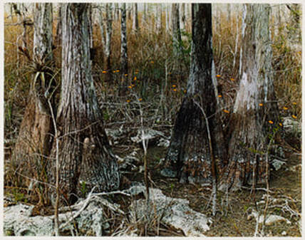
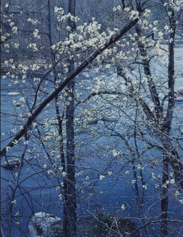
Tamiami Trail, Florida
|
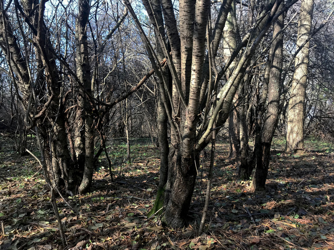
Dark Tree Trunks |
These pictures both seem similar because of their dark and mysterious look that they both have. The woods in both of the pictures seem to be going to forever. The trees in both of the pictures both have a very old, worn out, and possibly even dead look to them and it makes to picture look creepy, but also quite peaceful. I noticed that Porter had more colors in his picture, and it was a lot easier to make out really small details, and there is a variety of colors even though they all follow a mood. My picture is more dark and all of the colors seem to be looking the same and lacking the small spots of yellow and orange that Porter captures in his picture.
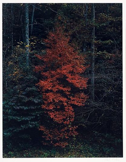
Red Tree Near Cades Cove, Great Smoky Mountains National Park, Tennessee
|
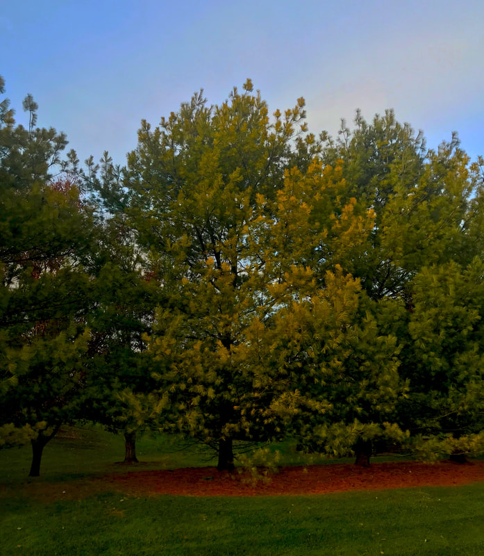
Bright Middle |
Both of the pictures are similar because they are both picture of bright, full trees. I noticed that in both of the pictures, there is a focal point where some of the color in the middle is brighter than the rest of the picture. In Porters picture however, the focal point is the different colored tree in the middle of the picture. In my picture, the focal point in the different yellowish glow in the middle and it gives something for the viewer to look at first. I also noticed that my picture showed the sky, and Porters didn't and it gave his picture a much more dark vibe to it.
|
|
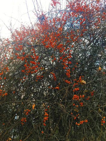
Vintage Works |
Splotches of Color |
I like this picture a lot because there seems to be a theme, and then the flowers are all the small splotches of color that seem to pop out. The colors in the two pictures are very different, but I also think that it reflects the overall picture in general with all of the vines and the flowers poking out. Both of the pictures are very exiting because there is not one thing to look at first. In both of the pictures the viewers eyes can go in a different place every time that they look at it. I also noticed although, that the vibes of the pictures are very different. Porters image is more peaceful and sad. My picture is more complicated and happy. Although they are pictures of very similar things, the moods are very different.
Personal Artist Statement
When I was trying to make my images look like Porters, they never really turned out quite like his because I tend to have en eye for brightly, and happily colored things. Most of the pictures that I have taken over this trimester have shown very calming, peaceful, and happy warm colors. In my photography, I also noticed that I used quite a but of depth, and balancing elements. I really like to have a variety of colors in my pictures, but I also make sure that all of the colors perfectly go together. I noticed as well that I also make my pictures have a lot of depth by making the pictures opacity, curves, or the brightness darker to give the pictures more depth but still leaving the bring happy colors as contrast with the darkness of other parts of my pictures. I also noticed throughout this trimester I have taken a lot of pictures that have texture to make the photos more interesting, and I also captured values. I like the values of light and dark together. Part of the picture being light, and others being dark it makes the lines of the pictures look way more dramatic. Overall, I think that all of the pictures represent happiness and peacefulness mostly in the documentation of things I love like nature, friends, and family.
